
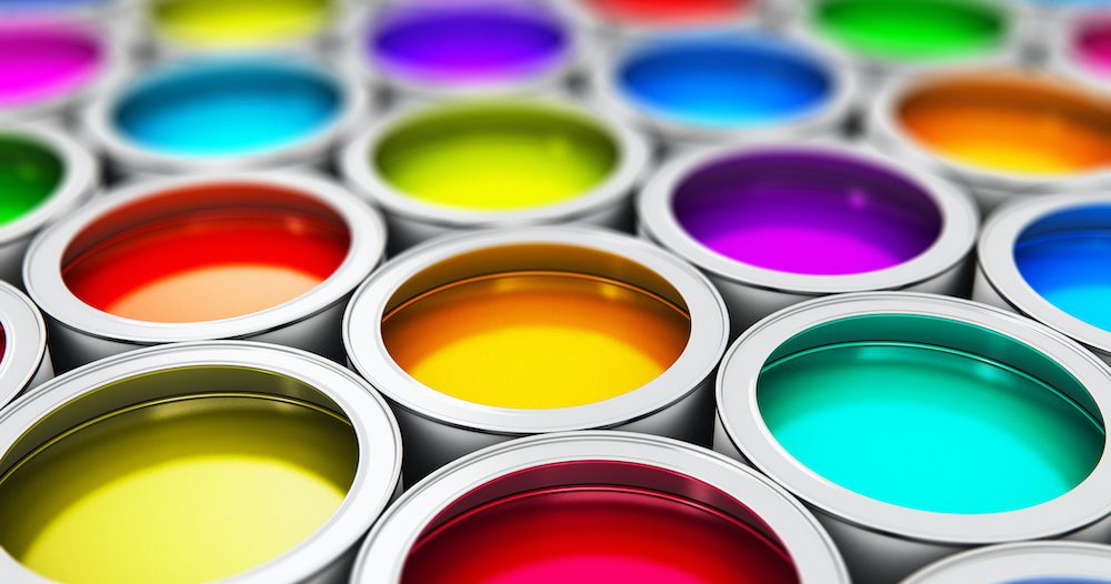
scanrail / Getty Images
The coronavirus pandemic has affected every facet of our lives—even, apparently, the colors we should paint our walls. As proof, look no further than the colors of the year for 2021.
The time has arrived when paint companies start rolling out their top hues that embody the era’s zeitgeist. And, with 2020 being unlike anything we’ve experienced in our lives thus far, it’s no surprise that COVID-19 has had a palpable impact on which colors are predicted to dominate fashion and home decor next year.
So far, many of the prevailing shades are warm and comforting, and tie back to nature—which makes sense, given that many of us have been cooped up at home and craving more time outdoors, says Debra Kling of the eponymous color consultancy.
So if you’re craving some color therapy in the form of a fresh coat of paint on your deck or in your home office or beyond, check out which color(s) of the year have been announced so far below.
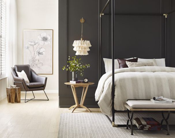
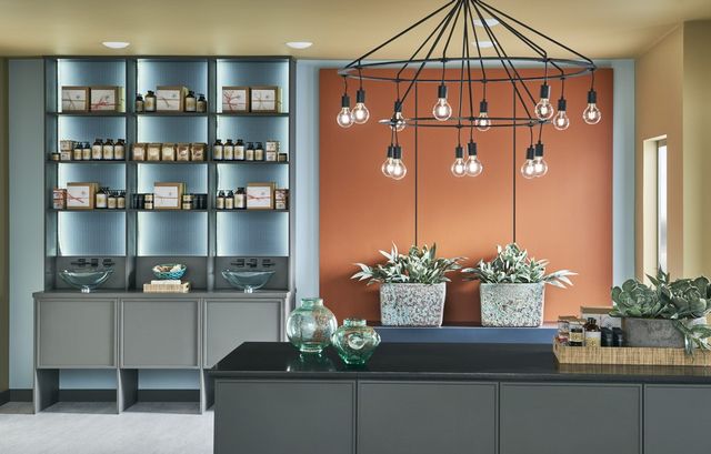
Sherwin-Williams 2021 Color of the Year: Urbane Bronze
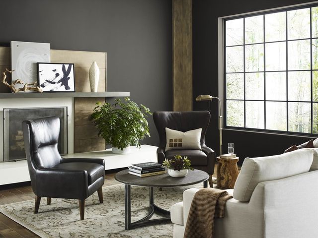
Sherwin-Williams
Urbane Bronze is the oh, so sophisticated pick of the year from one of the biggest paint companies, Sherwin-Williams. And a dose of this earthy shade is just what the doctor ordered as it “encourages you to create a sanctuary space for mindful reflection and renewal,” says Sue Wadden, the company’s director of color marketing.
Sherwin-Williams
And if you’re tired of those same cold grays slapped all over builder homes and new-construction condos, you’re not alone. This pivot to a warmer, more natural version is a welcome surprise across the board.
“We in the design community are just so done with cool, icy grays—and Urbane Bronze, which is actually a deep taupe that combines brown and gray, is a warm color that can both cheer and ground us,” says Kling.
Interior designer Ana Cummings agrees, and says the comfort of this rich and glamorous shade speaks to achievement, longevity, endurance, and standing tall through the storm.
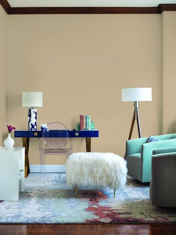
PPG 2021 Color Palette of the Year: Be Well
PPG
Yup—PPG’s color of the year is actually a trio: Transcend, a subtle sandy hue; Big Cypress, which is tinged with ginger, and one from under the turquoise sea, Misty Aqua.
This grouping also feels extremely of the moment, given the fraught times in which we’re living.
“Our global color stylists were drawn to these colors as they evoke feelings of compassion and comfort, which resonates and represents the shifting mood of society,” says Amy Donato, PPG’s senior color marketing manager.

PPG
Misty Aqua gets big raves from the design world, in part because it adds a playful, vibrant element, while the warm pink undertones of Transcend and Big Cypress are soothing and speak to positivity.
“Misty Aqua is lively and refreshing, and it fits with the trend of blues and greens that most people have been choosing over the last few years—and it would be perfect in a coastal home in Florida or California, or in a bedroom, sunroom, or home office,” says Amy Bly, the design genius at Great Impressions Home Staging and Interiors.
PPG suggests trying these shades with the 60-30-10 design rule, which means 60% of the room is painted in a dominant color, 30% in the secondary one, and 10% as an accent. The Be Well collection pairs nicely with greenery and blond or natural brown wood tones, too.
Behr 2021 Color Trends Palette
Behr
Not content with just a few shades, Behr has thrown wide its design doors and embraced 21 colors in a special collection for the coming year. This company’s shades also mirror our nation’s plight and encourage us to view our home as a place of refuge and rejuvenation.
The Behr collection is “a new, elevated articulation of comfort that goes beyond traditional beige, gray, and green hues, and embraces color in a way that can redefine and enhance any type of space,” says Erika Woelfel, the company’s vice president of color.
Behr
From quiet neutrals to bolder hues, Behr’s 21-color salute has been sorted into six accessible themes that touch on optimism, calm, and quiet, with shades for each that are made for mixing and matching.
For example, the theme Casual Comfort might live well in an updated farmhouse with the modern neutrals Almond Wisp and Sierra. Or if your rooms are craving a more moody design, look to the Quiet Haven combo of Royal Orchard, a forest green, and Broadway, a mysterious steely gray.
In the ensuing weeks, many more paint companies will announce their 2021 colors of the year, and we’ll be sure to cover them all right here. Stay tuned!
The post See What COVID-19 Has Done to 2021’s Colors of the Year appeared first on Real Estate News & Insights | realtor.com®.